Leer en español: Cómo leer una curva MTF
The first time you open a lens datasheet and meet those curves rising and falling like an electrocardiogram, the temptation is to turn the page and settle for the sample photo. It is understandable, but it is a mistake, because that graph is the most honest report there is on a lens’s character. It just comes encrypted.
This article is the key to that cipher, and it works in both directions. First, from curve to cause, to find out which aberration produces a given shape. Then, from desire to curve: if what you are after is three-dimensional pop, creamy backgrounds or the glow of old lenses, you will see exactly what to demand from the graph before spending the money. At the end we will read the datasheets of eight lenses together, from the classic Summicron to the Noctilux f/1, to see the method at work.
One idea holds everything else up: a lens’s character is the set of aberrations its designer decided not to correct. Behind it lie design compromises, and almost all of them can be read in these curves if you know where to look.
What an MTF measures and what it leaves out
The MTF measures what fraction of the contrast of a sinusoidal target survives passage through the lens, as a function of two things: spatial frequency, in line pairs per millimeter, and image height Y, the distance from the center of the frame measured in millimeters on the sensor. On full frame, the corner sits at 21.6 mm.
Before reading a single value, keep three caveats in mind. First: manufacturer datasheets are usually calculated from the design rather than measured on real units, so they include no manufacturing tolerances, decentering or coatings. Second: they are plotted at best focus and almost always at infinity, while you take your portrait at two meters, where behavior can differ (that is why floating elements exist). Third: they are polychromatic, integrating the whole visible spectrum, which dilutes longitudinal chromatic aberration until it is almost invisible. We will come back to this, because it is the most important blind spot of all.
Anatomy of the datasheet
The format published by Leica and Zeiss is the most informative there is. It plots four frequencies (5, 10, 20 and 40 lp/mm, stacked from top to bottom) and two curves for each: the tangential (T, solid line), which measures how structures perpendicular to the radius are resolved, and the sagittal (S, dashed line), for structures oriented along the radius. And it repeats the whole family at full aperture and at f/5.6.
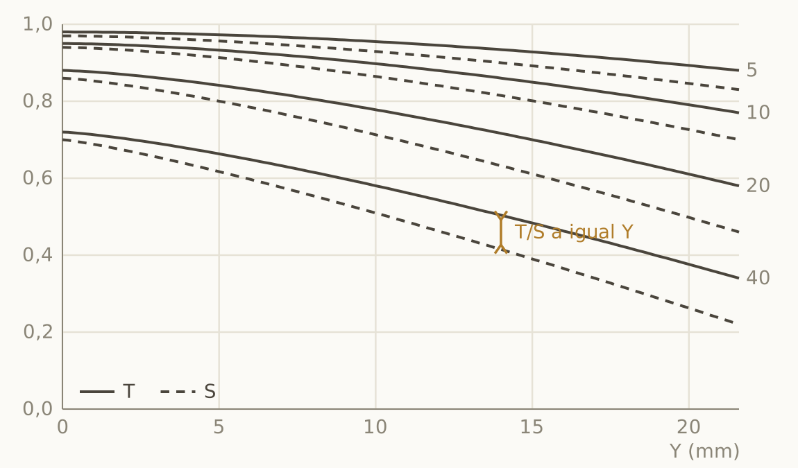
Each frequency band tells a different story, and it is worth learning by heart, because half the interpretation lies here:
- 5 and 10 lp/mm: the contrast of large masses. This is where relief, brilliance and the sense of depth come from. Hubert Nasse, Zeiss’s great laboratory scientist, showed that this band dominates the subjective judgment of quality far more than raw resolution.
- 20 lp/mm: the sharpness you perceive at normal viewing distance.
- 40 lp/mm: microcontrast, fine texture. This band governs the border between clinical and gentle.
There is a golden rule that avoids the most common mistake: always compare T with S at the same frequency, and never neighboring curves of different frequencies. With four stacked bands it is very easy to pick the wrong pair.
The protocol: ten steps in front of any datasheet
This is the order I follow every time I open a datasheet. With a little practice it takes two minutes.
- Read the four values at Y = 0 at full aperture. The 10 lp/mm value predicts relief; the 40 lp/mm one, whether the lens will be clinical or soft.
- Measure the gap between the full-aperture family and the f/5.6 family at the center. If it is large, there is a lot of spherical aberration; if it is nearly zero, the design is apochromatic at the limit.
- Look for separations between T and S at each field height.
- Follow the monotony of each curve: if it dips into a valley and climbs back, with T and S moving together, there is field curvature.
- Look at the corner at 5 lp/mm: it tells you whether large masses reach the edge with contrast, which is what shows in a print.
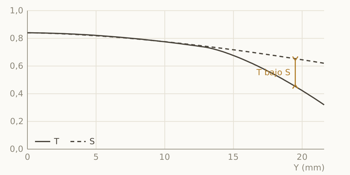
- Compare tangentials and sagittals in the last third, also at f/5.6: if T is persistently worse, it is lateral chromatic aberration.
- Note the height at which degradation begins: that marks the edge of the area where you can place your subject.
- Classify each defect: curable by stopping down (spherical, coma) or structural (astigmatism, curvature, lateral chromatic aberration).
- Open the vignetting and distortion sheet in the same document: they are not in the MTF and they change the aesthetic reading.
- Remember what you have not seen: veiling flare, the sign of the spherical aberration, longitudinal chromatic aberration, the structure of the defocus disc. There is a whole section devoted to those silences.
Every aberration leaves its fingerprint
This table is the summary for the fridge door. Below it, each signature with its graph.
| Aberration | MTF signature | Confirmation test |
|---|---|---|
| Spherical (SA) | Depression at the center too, at full aperture | Cures spectacularly at f/5.6 |
| Glow (high SA) | 5 and 10 lp/mm sunk on axis, 40 lp/mm with a decent tail | Low contrast with high resolution |
| Coma | T/S separated and sunk in the outer third | Disappears at f/4 or f/5.6 |
| Astigmatism | T/S separation at the same height Y | Persists when stopping down |
| Field curvature | Non-monotonic oscillation with T and S in phase | Persists; the valley shifts |
| Lateral chromatic aberration | T below S at the edge of the field | Immune to aperture |
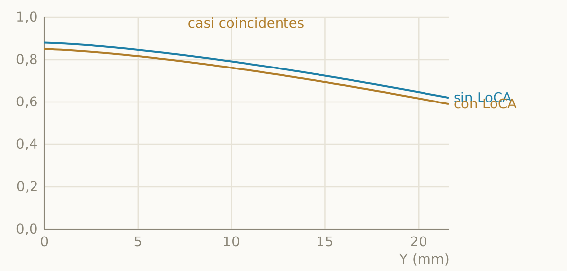
| Longitudinal chromatic aberration | Almost invisible: a small, uniform loss | Per-wavelength curves or real images |
Spherical aberration, mother of character
It is the only monochromatic aberration that also acts at the center of the field, and that makes it easy to detect: contrast depressed at Y = 0 at full aperture that improves spectacularly when stopping down. The size of the gap between the two families of curves measures how much spherical aberration is left uncorrected.
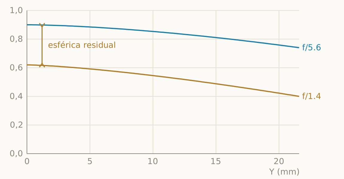
The MTF at best focus, however, is blind to the sign of the spherical aberration, and that is an essential limit you should remember. An undercorrected and an overcorrected lens with the same magnitude give almost identical curves, and the sign is precisely what decides whether the bokeh is creamy or nervous. To find out you need to look outside the datasheet: the focus shift when stopping down (backwards means undercorrected, forwards overcorrected) or directly at the defocus discs in real photographs.
Glow
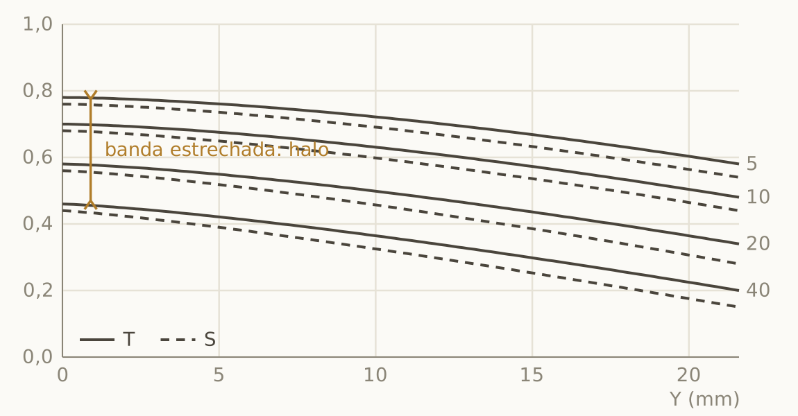
When spherical aberration is very high and some internal scattering is added, a point of light is drawn as a sharp core surrounded by a wide halo. That halo steals contrast from large structures without destroying fine detail, and it has an unmistakable signature: the low frequencies abnormally sunk on axis while the 40 lp/mm curve keeps a reasonable tail. Low overall contrast with surprisingly high resolution is the mark of the spherical veil, and the Thambar is its textbook extreme case.
Coma and astigmatism: the aperture test
Both separate T from S across the field, and the way to tell them apart is biographical: coma dies when you stop down and astigmatism survives. If the separation closes at f/4, it was coma; if it persists, it is astigmatism, or curvature if T and S oscillate together.
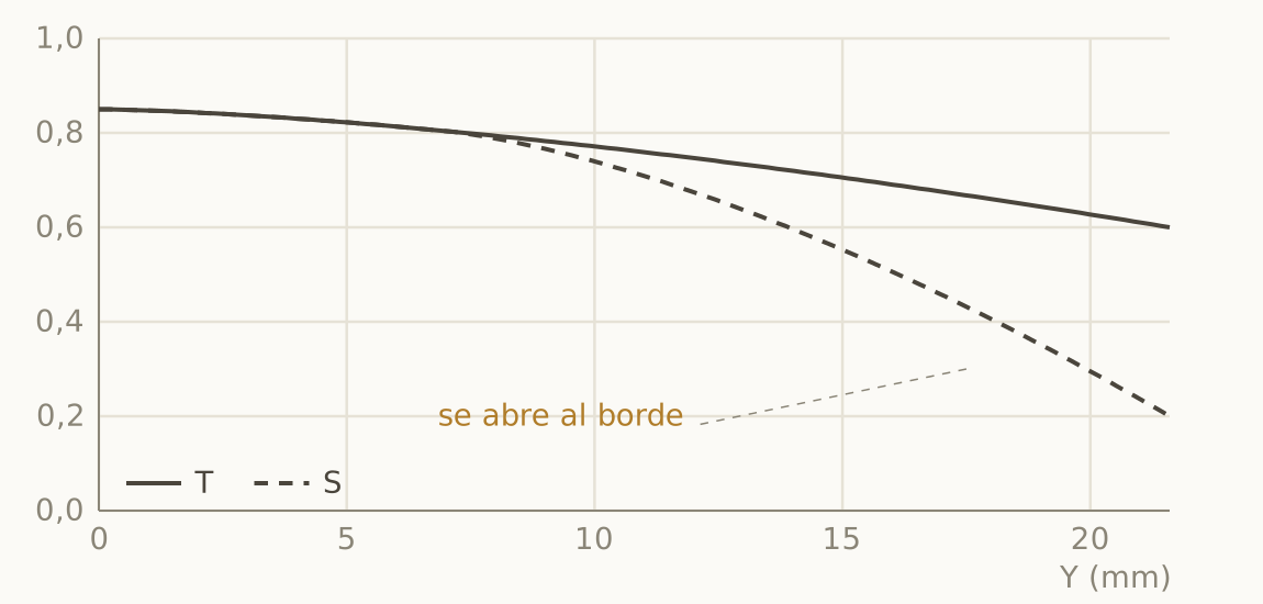
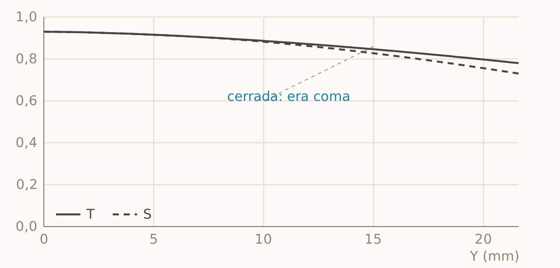
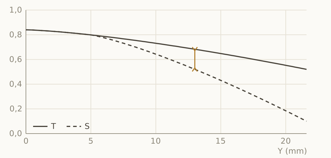
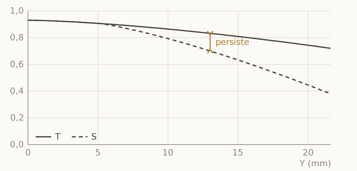
By the way, what exactly are tangential and sagittal? At each point on the sensor there are two possible orientations of detail: sagittal structures follow the direction of the radius joining the center to that point, and tangential structures cross it at right angles. If the lens resolves both equally, the image of a point is symmetric. If not, the point is drawn as a short segment, and the texture of a fence looks sharp in one direction and blurred in the other. That asymmetry is astigmatism, and the vertical distance between the two curves measures it.
Field curvature
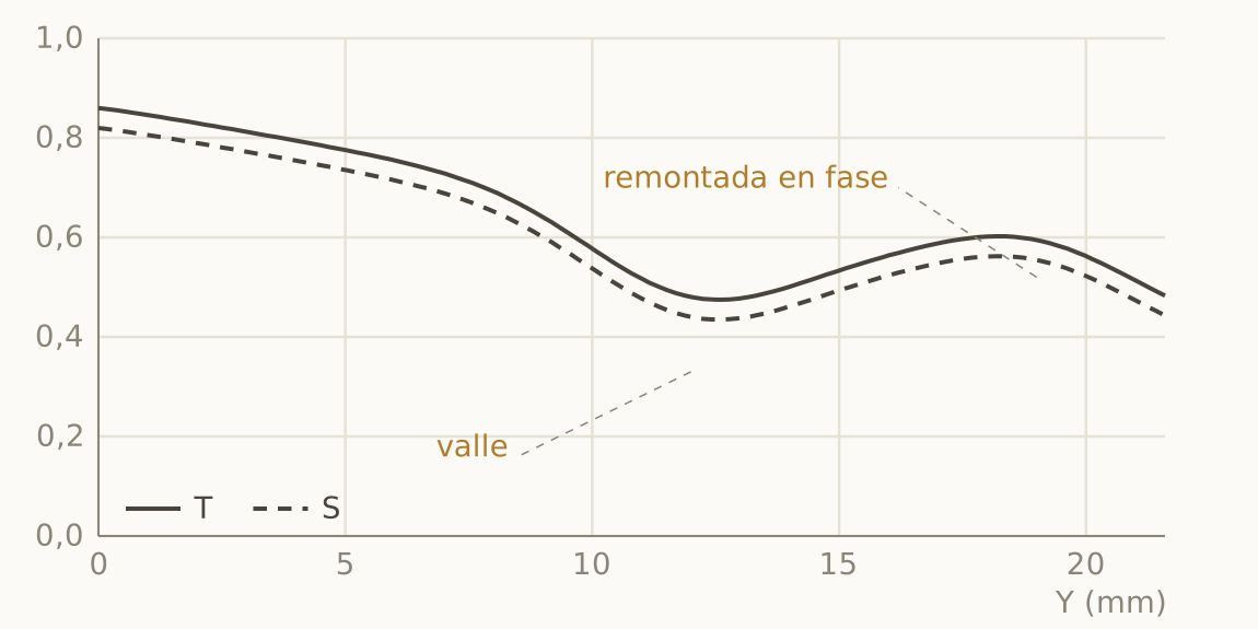
In many designs, the surface where the lens actually focuses is a curved shell instead of a plane, and it cuts the sensor in rings. The consequence in the graph is those oscillations that drop, form a valley in the mid zone and climb back toward the corner, moving T and S in phase. If they oscillate separately there is astigmatism as well, because the T and S surfaces are two different shells.
Lateral chromatic aberration
Here image magnification depends on wavelength: the point is stretched radially into a small rainbow that blurs tangential structures at the edge. Its signature is the tangentials sitting persistently below the sagittals in the last third, completely indifferent to aperture. The good news is that software corrects it very well and it hardly affects character.
Longitudinal chromatic aberration, the great blind spot
Longitudinal chromatic aberration (LoCA), the one that paints magenta fringes in front of the focal plane and green ones behind it, is probably the aberration that does most damage to bokeh, and also the most treacherous one on a datasheet. In a polychromatic MTF it is diluted into a small, uniform loss, indistinguishable from any other cause, and in calculated catalog datasheets not even that. It can only be detected in real images or with per-wavelength curves, which almost nobody publishes.
From desire to curve: what to ask of the datasheet
Let us turn the telescope around. If you already know what kind of image you are after, this is what you must demand.
3D pop
That feeling of the subject detaching from the background is, at bottom, a matter of gradients. Ask for high, flat 5 and 10 lp/mm curves across the central third at full aperture (0.9 or more), a moderate gap relative to f/5.6, and, on the next sheet, between 1 and 2 EV of vignetting, which acts as a spotlight and works for you for free. The MTF cannot guarantee low LoCA or deep blacks, which depend on the coatings. Nasse’s observation sums it up: of two lenses with the same limiting resolution, the one that wins at 10 and 20 lp/mm looks more three-dimensional, even if it resolves fewer lines.
Creaminess and double lines: it is all in the disc
Here the datasheet only gives the necessary condition (a large gap between families, that is, plenty of spherical aberration), and the sign decides the result. With undercorrected spherical aberration, the defocus disc concentrates light in a bright core that fades toward the edge: thousands of those overlapping discs melt together like watercolor, and that is what your eye calls creaminess. With overcorrected spherical aberration a bright ring appears at the edge of the disc which, overlapped along an out-of-focus branch, doubles it: the dreaded double-line bokeh. Forums keep repeating that double lines are caused by astigmatism, but the culprit is spherical aberration with the wrong sign; astigmatism produces very different effects and here it is an innocent suspect.
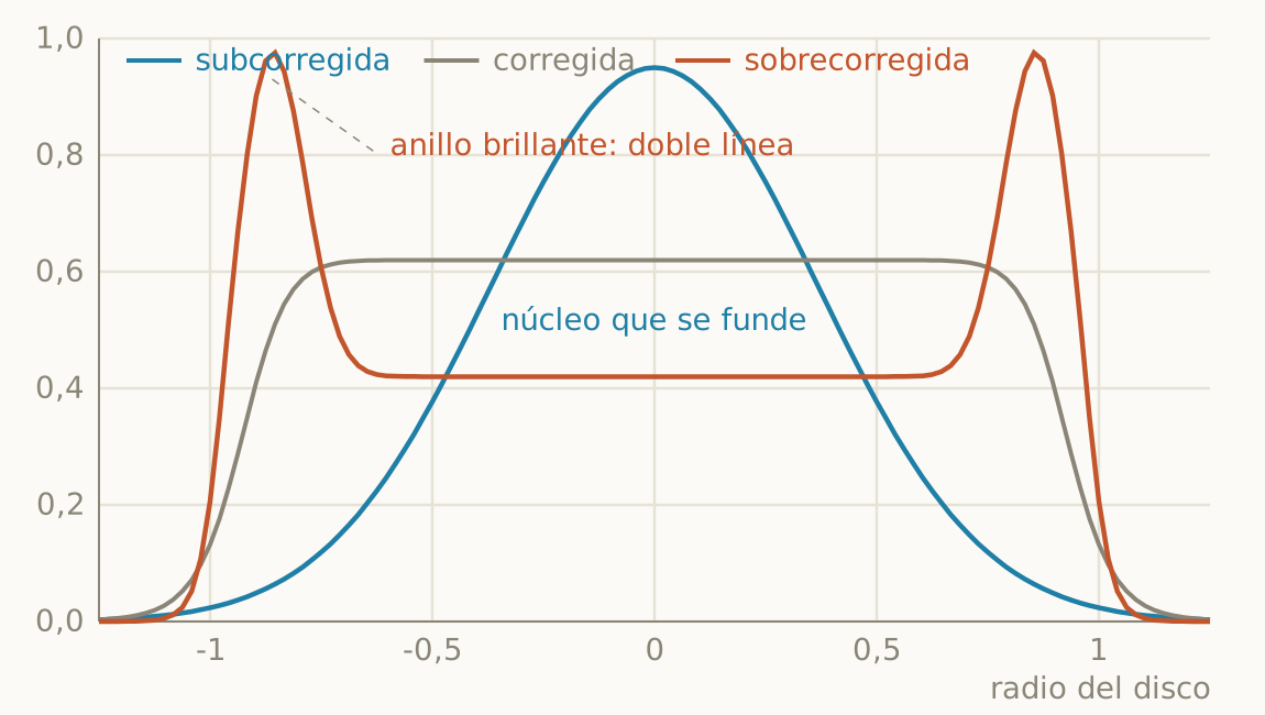
Almost nobody mentions that the effect is antisymmetric. The same lens that melts your background into watercolor hardens the defocus of the foreground, because the spherical term does not change sign between the front and the back of the focal plane, while defocus does.
Dreamy glow and swirl
For glow, look for the signature you already know (low frequencies sunk on axis, the 40 lp/mm curve with a tail) and add two requirements: that the halo switches off by f/2.8, because what you want is to be able to choose it, and a moderate veil that feeds it. For swirl you need two ingredients: strong astigmatism in the outer third, which does show in the datasheet as a large, persistent T/S gap, and mechanical clipping of the pupil, which does not: look for it on the vignetting sheet, where a sudden drop of more than 2 EV gives away a heavily clipped pupil.
Clinical or elegant
The clinical look has its own signature: the 40 lp/mm curve glued to the 20 across the whole field and an almost zero gap between apertures. If you do not want it, look for the compromise of classic elegance: high 10 and 20 with the 40 deliberately dropped toward 0.6 or 0.7. That gives you relief with a gentle drawing, high macro with moderate micro, which is the recipe of the classic Leicas. The perfect counterexample is the APO-Summicron 50, almost fully corrected, which many of its users describe with the same words: perfect but cold. MTF perfection and the aesthetic optimum need not coincide.
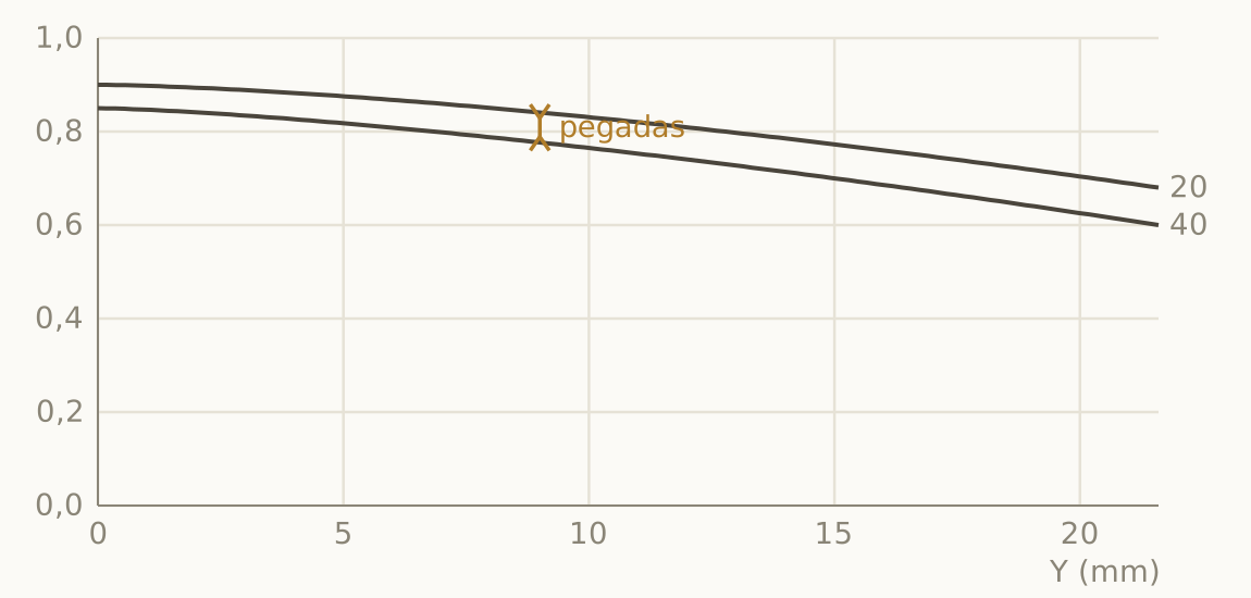
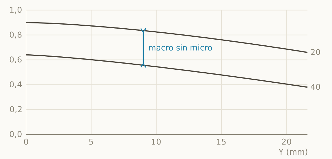
As for corners that melt away, a strong drop of all frequencies in the last third with the 5 lp/mm curve holding up means that the masses get there and the detail does not. The result is an expressive periphery without geometric destruction, which for a lot of photography is exactly what one wants.
What the datasheet keeps quiet about (and where to look for it)
| Quality | Why it is not in the MTF | Where to look |
|---|---|---|
| Veiling flare, black level | The MTF is normalized to 1 at zero frequency, and the calculation ignores coatings | Real backlit scenes, coating generation |
| Sign of the spherical aberration | Symmetry of the MTF at best focus | Focus shift, defocus discs |
| Longitudinal chromatic aberration | Diluted by polychromatic integration | Out-of-focus edges in images |
| Aspheric ripple (onion rings) | It is fine structure of the disc, not of the focal plane | Enlarged highlight discs |
| Cat’s eye, swirl | A property of the off-axis pupil | Vignetting sheet, corner discs |
| Vignetting and distortion | They come on separate sheets | Relative illumination sheet |
| Focus shift | It is a phenomenon between apertures, not of a single one | Focus series while stopping down |
| Bokeh in general | It requires the full 3D point spread function, not its in-focus slice | Real images |
The practical corollary, uncomfortable and liberating at once, is that two lenses with identical MTF datasheets can render differently. The textbook case is the Summilux-M 50 ASPH in its 11891 and 11728 versions: identical curves, the same formula of 8 elements in 5 groups, and the real differences are mechanical (focusing to 45 cm, 11 blades, hood) plus, perhaps, the coatings. All the forum debate about whether they “render differently” does not have a single optical datum behind it.
Eight datasheets, read for real
Theory is fine, but this is learned by reading datasheets of named lenses. Before we start, I should warn you that the graphs that follow are approximate redrawings based on published datasheets and measurements, made to illustrate the reading, and that they do not replace each manufacturer’s original datasheet. Each example closes with its translation into the image (pop, creaminess, disc edge, glow), and I point out when the information comes from the blind spots and not from the graph.
Mandler 50 f/1.4 E46 Pre-A: three panels, one story
First, a word on names. Here Mandler is a modern brand paying tribute to Walter Mandler, the legendary designer at Leitz Midland who signed three lenses on this list. Its 50 f/1.4 reinterprets the pre-ASPH Summilux with 7 elements in 5 groups, all spherical, current glass (the manufacturer claims 20 to 25% more resolution than the original), 12 blades and a minimum focus of half a meter. The idea is to put a modern center over a deliberately classic periphery.
The datasheet tells it exactly that way. Center at 0.99 / 0.96 / 0.87 / 0.69: excellent macro contrast and high micro contrast without becoming clinical. The first third shows no trace of astigmatism. In the mid zone, by contrast, the sagittals collapse (the 40 lp/mm one touches 0.07 at Y = 12.6 with the tangential still at 0.45) and then climb back toward the corner. A huge separation plus a non-monotonic oscillation gives away severe astigmatism riding on field curvature.
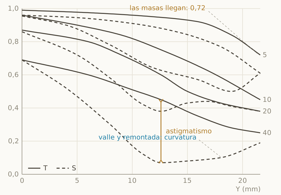
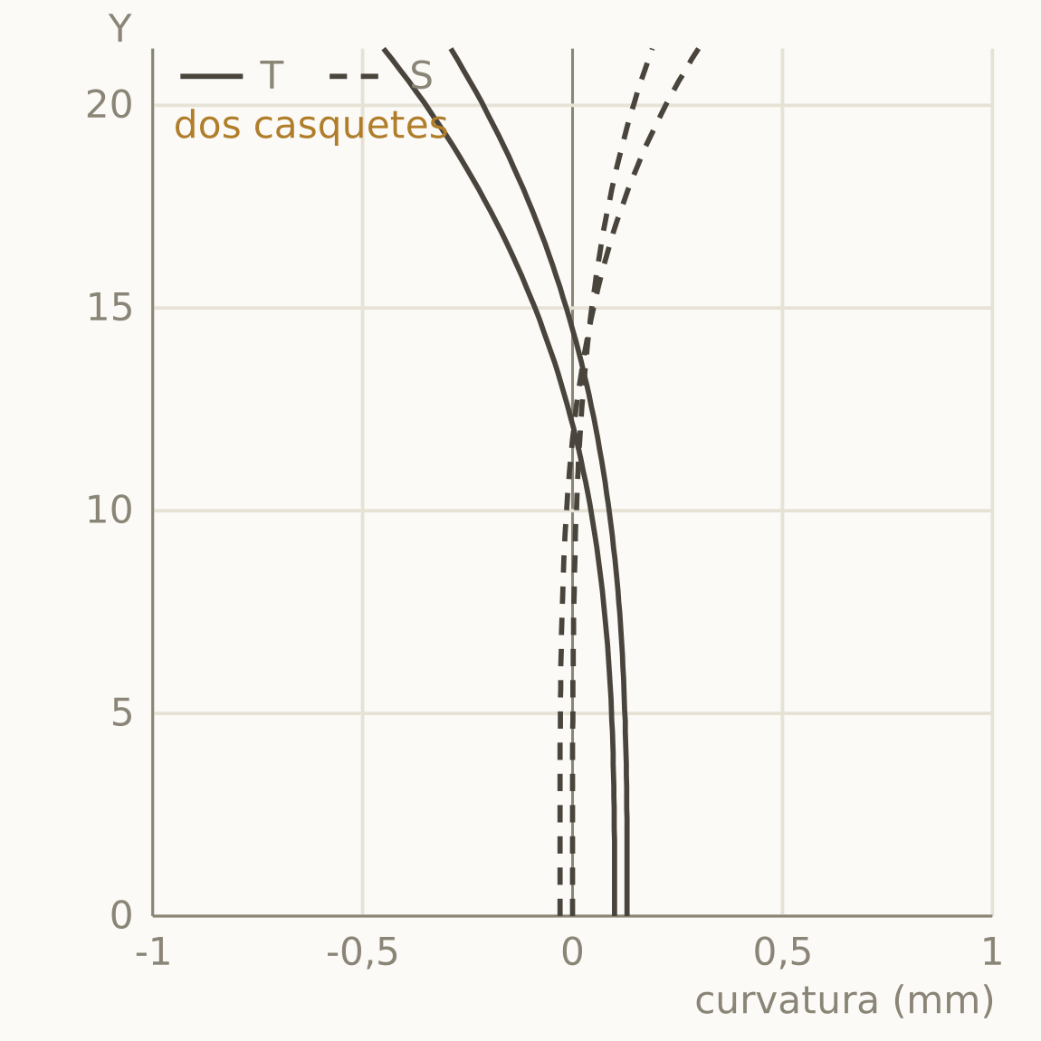
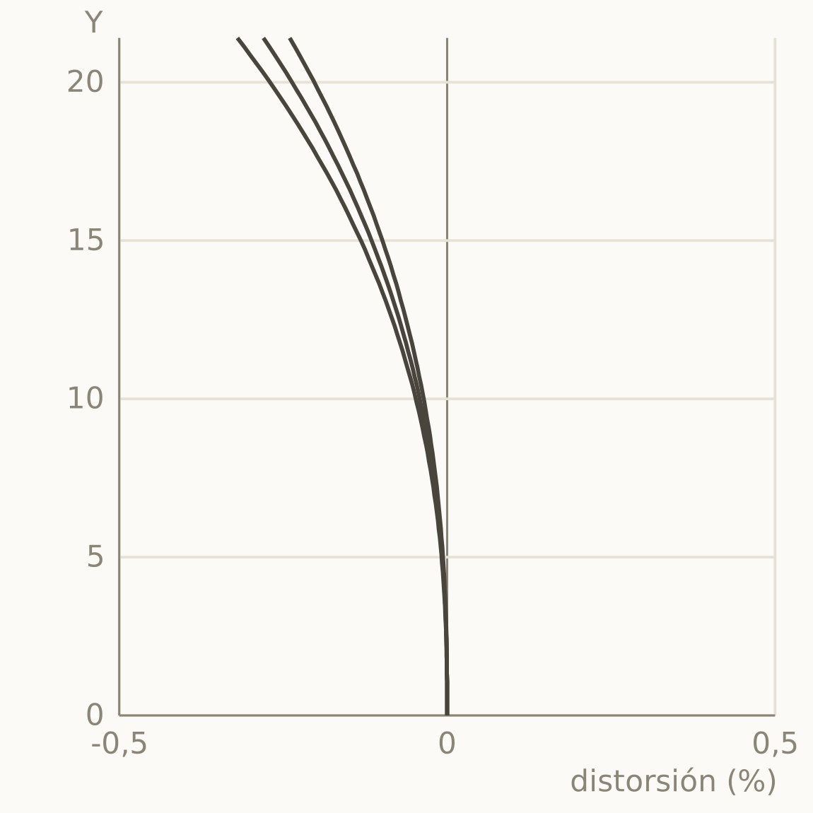
This is the best example in the article because the manufacturer also publishes the two panels that confirm the diagnosis. The field curvature panel shows the T and S surfaces separating toward the edge into two shells of opposite sign: the sagittal recovery in the MTF is, literally, its shell cutting the sensor again. Distortion, for its part, stays below 0.3%, which is aesthetically irrelevant. So the three panels tell a single, coherent story.
| 3D pop | High in the central third: macro 0.96 and flat, with the blacks of modern glass; the 36 mm pupil finishes off the separation of planes. |
| Creaminess | Creamy center and swirling periphery: astigmatism with curvature stretches the discs, and the manufacturer declares the swirl as an intended trait. |
| Disc edge | Soft: undercorrected spherical aberration inherited from the pre-ASPH, no aspherics and therefore no onion rings; 12 blades keep the disc round when stopped down. |
| Glow | Slight at f/1.4, toned down compared with the original by current glass and coatings. Sign and focus shift, as always, to be confirmed in the discs. |
Summilux-M 50 f/1.4 ASPH: the modern one with a secret
Center at 0.97 / 0.93 / 0.85 / 0.68: reference macro contrast and high micro contrast that deliberately stops one step short of clinical. The falloff is smooth and monotonic, with moderate astigmatism growing from Y = 8 without drama and nothing seriously structural. An almost boringly good datasheet. Its famous weak point, longitudinal chromatic aberration, is very noticeable at the edges of the bokeh and stays out of the graph, as does the slightly overcorrected spherical aberration with mild focus shift. So the flawless datasheet hides the real defect.
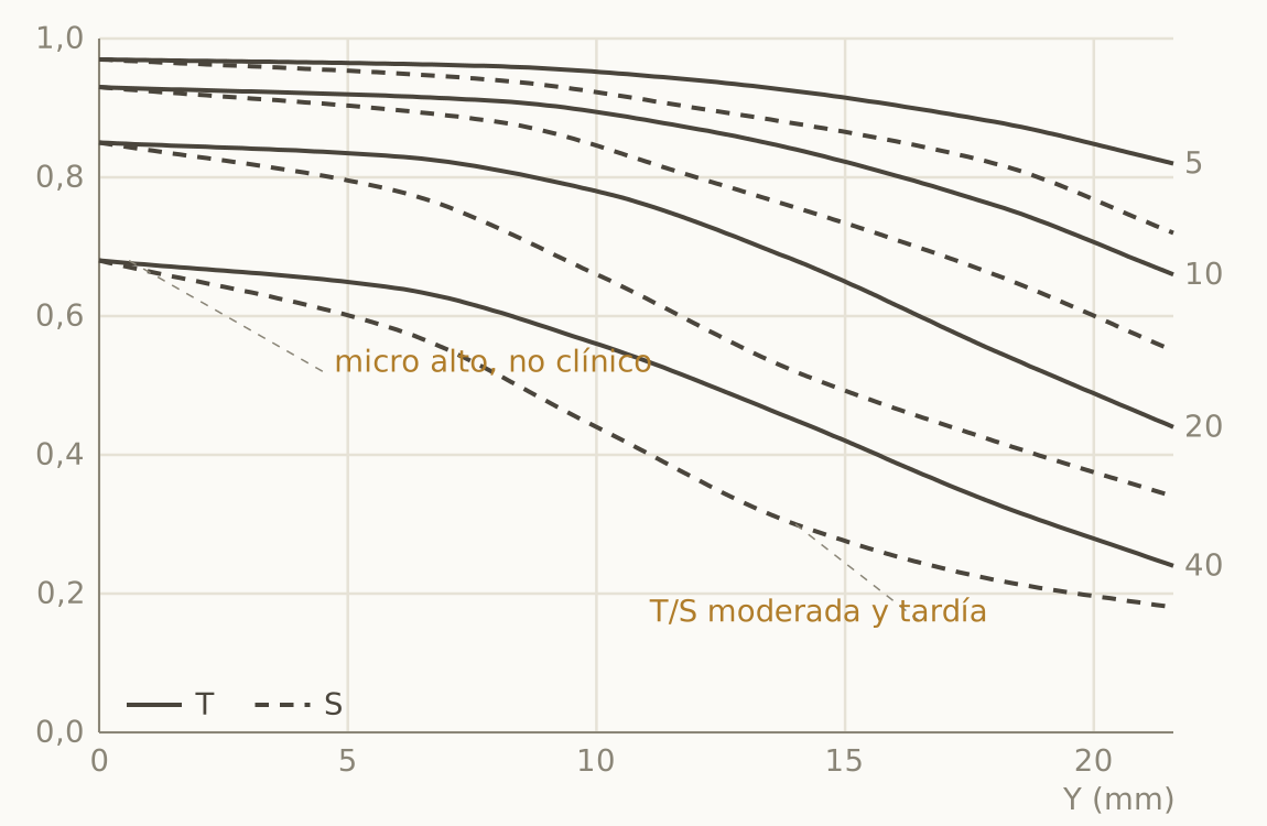
| 3D pop | High: macro 0.93 at 10 lp/mm, deep blacks and 2.2 EV of vignetting that frame the eye. |
| Creaminess | Medium: the slight overcorrection gives a disc with a barely hinted edge that hardens foliage at middle distance; the foreground, by antisymmetry, comes out soft. |
| Disc edge | Hinted, with some aspheric ripple in point highlights; the real stain on the bokeh is LoCA, with its magenta and green fringes invisible in the datasheet. |
| Glow | None. |
Summicron-M 50 f/2 (Mandler design, 1979): the yardstick
Six elements and inexpensive glass, with cost optimization raised to an art, deliver 0.96 / 0.92 / 0.82 / 0.62 at the center at full aperture. Note that 0.62 at 40 lp/mm: it is exactly the elegant zone we were talking about, high macro with moderate micro, a gentle drawing without sacrificing relief. There is slight mid-zone curvature that flattens the sagittals without forming a valley, the astigmatism is restrained, and at f/5.6 it comes close to apochromatic behavior. For decades it was the bar against which everything else was measured, and the datasheet explains why.
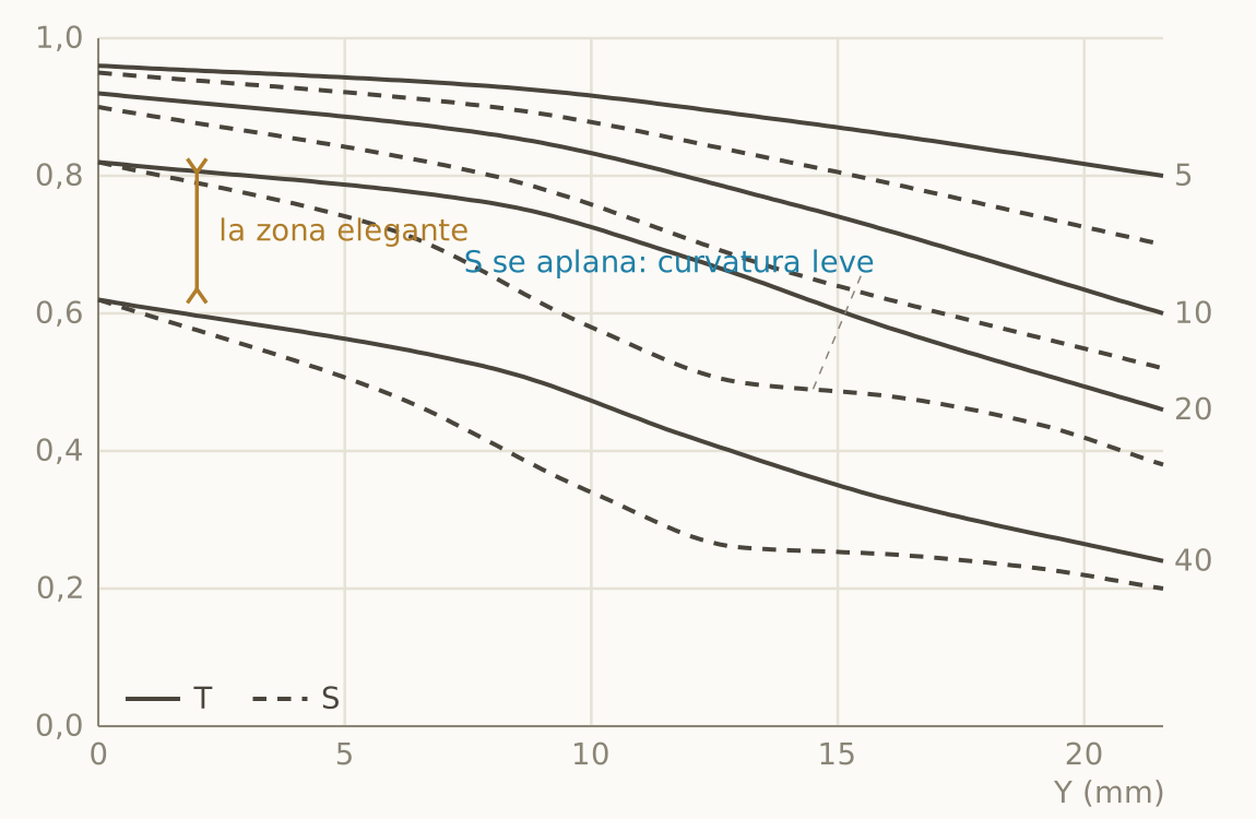
| 3D pop | Medium-high: excellent macro at f/2 and honest blacks; it lacks the aperture to separate planes violently. |
| Creaminess | Medium-high: gentle undercorrection, a docile transition, a background that melts without calling attention to itself. |
| Disc edge | Clean and ringless: no aspherics, zero onion rings. Polite bokeh rather than spectacular. |
| Glow | None. The summary is elegance: moderate micro over high macro, kind to skin. |
Summilux-M 75 f/1.4 (Walter Mandler, 1980): textbook glow
This is the signature of massive spherical aberration in its pure state, with the whole family depressed at the center too and the 40 starting at 0.38. The superimposed blue curve shows the diagnostic test: the 20 lp/mm one jumps from 0.55 to 0.90 when stopped down to f/5.6. A curable defect is a switchable defect: at full aperture you get a sharp core wrapped in a halo and, two stops down, a serious lens. The spherical aberration is undercorrected, with backward focus shift and a watercolor background. That is why, on forums, the name Mandler stands for a rendering as much as for a designer.
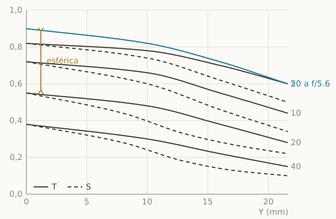
| 3D pop | Moderate at f/1.4: the spherical veil tempers the blacks; it goes up a step when stopped down one stop. |
| Creaminess | High: frank undercorrection, bright core and fading edge, textbook watercolor. The out-of-focus foreground, on the other hand, comes out harsh. |
| Disc edge | Fading, no onion rings; LoCA does stain the transitions, and it is its real Achilles’ heel. |
| Glow | Present and switchable: halo at f/1.4, gone at f/2.8. Backward focus shift when stopping down, outside the datasheet. |
Noctilux-M 50 f/1.0 (Walter Mandler, 1976): the lowest datasheet ever published with pride
Mandler designed the Summicron above, the Summilux 75 and this one; the 75/1.4 and Noctilux f/1 pair is what forums call the Mandler look, and what the namesake brand of the first example pays tribute to. The datasheet is the whole protocol in extreme mode: the entire family sunk on axis too (massive spherical aberration at a 50 mm pupil), with the 40 starting at 0.26; a sagittal collapse in the outer field that mixes coma, the part that cures when stopping down, with astigmatism; and the blue 20 lp/mm curve at f/5.6 jumping from 0.44 to 0.88, the most dramatic transformation in the Leica catalog. The lesson has to do with the lens’s category and not with its degree of correction, because this datasheet does not measure its purpose, which is to photograph the light that is not there. Judging it by the standard of a modern corrected design is a mistake of approach.
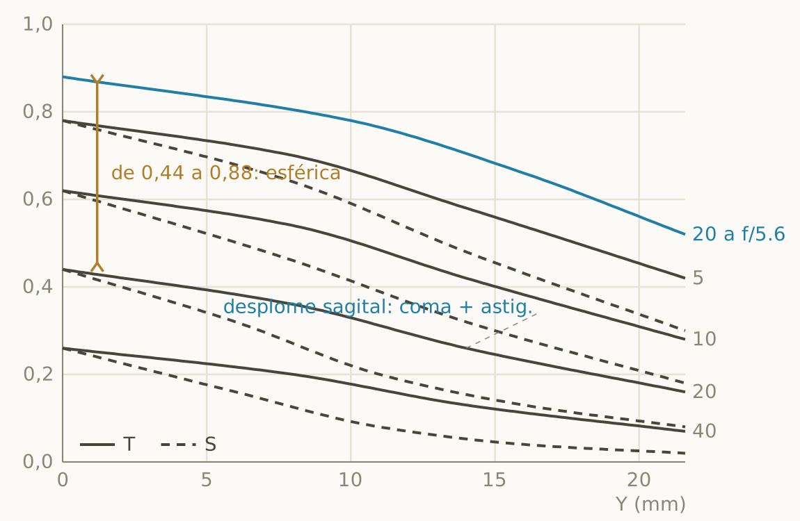
| 3D pop | Through isolation, not contrast: veiled blacks at f/1, but brutal separation thanks to the 50 mm pupil and more than 3 EV of vignetting that melt the corners into shadow. |
| Creaminess | High and turbulent: a core melted by undercorrection, but very severe cat’s eye that stretches the discs and tends toward swirl, outside the datasheet. |
| Disc edge | Fading, no onion rings (there are no aspherics); coma deforms point highlights in the corners into comets, and LoCA is generous. |
| Glow | The king of the night halo at f/1, gone from f/2.8. Noticeable focus shift. Dreamlike without excuses. |
Summilux 35 Aspherical (Light Lens Lab replica of the 11873)
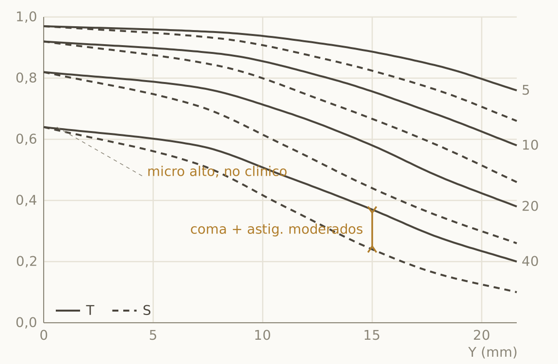
The 1990 Summilux-M 35 Aspherical was Leica’s first 35 with aspherics: two surfaces ground one by one, some two thousand units made, the bridge between the pre-ASPH and the production ASPH. Light Lens Lab has brought the formula back to market, and its datasheet is transitional, and it shows. The center reads 0.97 / 0.92 / 0.82 / 0.64, with micro contrast that is high but not clinical and low veiling flare for its time. The first third holds up clean, and from 9 mm onward T and S open up with a mix of coma (the part that closes at f/5.6) and moderate astigmatism, without the sagittal collapse of the Mandler 50. Its spherical aberration is moderately undercorrected, right in that sweet spot of “slightly imperfect” we were talking about.
| 3D pop | High: macro 0.92 at 10 lp/mm, decent blacks and 2.3 EV of vignetting. |
| Creaminess | Medium-high and balanced: moderate undercorrection, a core that melts without theatrics. The profile closest to the ideal recipe of slight spherical aberration, restrained LoCA and generous vignetting. |
| Disc edge | Soft, but with noticeable ripple in point highlights: first-generation aspherics, visible when enlarged and outside the datasheet. |
| Glow | None; corner coma at full aperture that fades when stopping down. Slight focus shift. |
Light Lens Lab Z21: photography from 1932
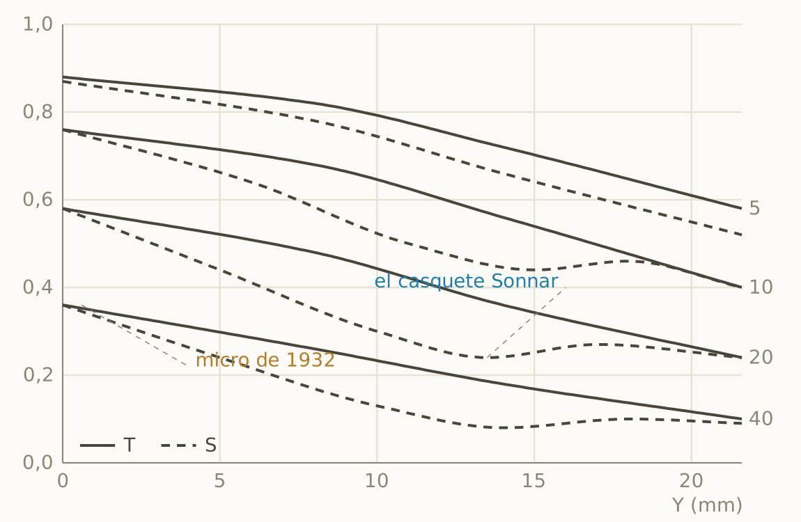
It is a replica of the original Sonnar 5cm f/1.5, so its datasheet is a period document. It has low micro contrast (0.36 at the center), sagittals with a valley around Y = 13 and a clear recovery (the Sonnar’s curvature shell), and large, persistent T/S separations. Even so, the 5 lp/mm curve holds up with dignity and the masses glow, which is the Sonnar charm of old. The datasheet does not tell you that the replica uses modern coatings, so the veil is lower than the original’s, or that it inherits the design’s legendary focus shift, the same undercorrected spherical aberration that gives it the melted background.
| 3D pop | Low to medium: glowing masses over tempered blacks. The Sonnar glow is relief without harshness. |
| Creaminess | Very high: the background melts into discs with luminous cores; the foreground comes out brittle because of antisymmetry. |
| Disc edge | Fading and without onion rings; marked cat’s eye with a tendency toward gentle swirl, courtesy of the Sonnar clipping, outside the datasheet. |
| Glow | Present at f/1.5, period-correct, though cleaner than the original thanks to modern coating. Legendary focus shift. |
Bonus: the Sigma format, another language
Not every datasheet speaks the Leica/Zeiss dialect, and it pays to know how to translate. The Sigma format, here with a fast 35 mm at full aperture, requires recalibrating three conventions. There are only two frequencies: red for 10 lp/mm and blue for 30, halfway between Leica’s 20 and 40. The line convention is reversed: solid is sagittal (S) and dashed is meridional (M, the familiar tangential). There is no f/5.6 family either; instead, Sigma publishes two panels of the same lens: the diffraction MTF, the full and realistic wave-optics calculation, and the geometric one, ray tracing only, which by construction is always equal or higher.
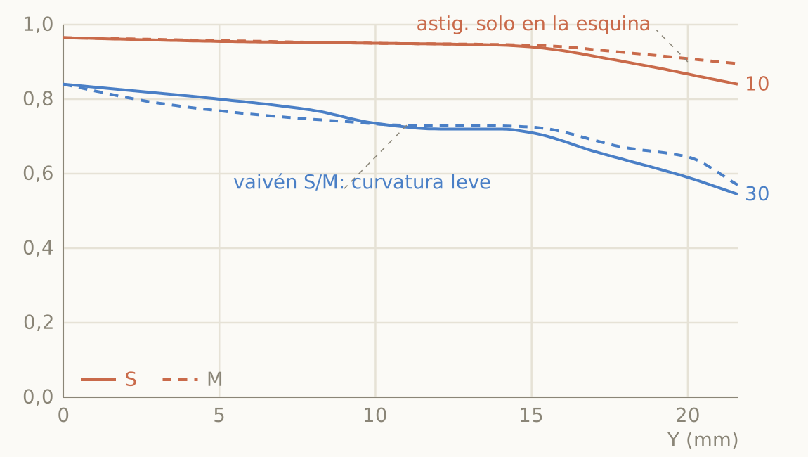
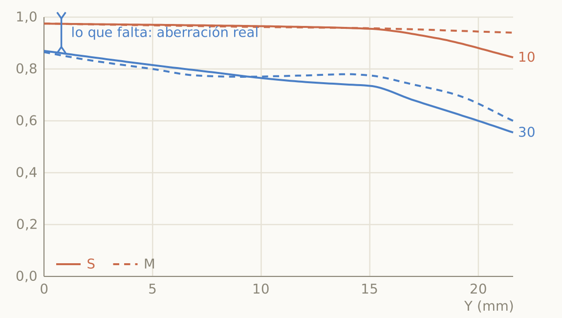
The center reads 0.97 at 10 lp/mm and 0.84 at 30, apochromatic territory at full aperture, and the four curves stay almost horizontal up to 15 mm. That leaves two thirds of the field usable for the subject, something even the best classics never dreamed of. The small wobble of the blue curve in the mid zone is a slight difference in curvature between the two focal surfaces, of trivial amplitude. The diagnosis specific to this format comes from comparing panels, which partly replaces the missing stopped-down family: the geometric curve sits only marginally above the diffraction one (0.87 against 0.84 at the center at 30 lp/mm). At the full aperture of a fast lens, diffraction is negligible, so that short distance tells you that the little that is missing up to 1 comes from real residual aberrations, and few of them. A classic would have the geometric curve far above wherever its aberrations dominate.
| 3D pop | High: 10 lp/mm band flat up to 15 mm and, in these fast designs, more than 2 EV of vignetting at full aperture. |
| Creaminess | Medium-low: high correction implies an almost uniform disc with a defined edge. Correct bokeh that stops short of melting. |
| Disc edge | Defined; with aspherics of this grade it is worth watching for ripple (onion rings) in point highlights, invisible here. |
| Glow | None; micro contrast on the clinical side. If character appears, it will be in the blind spots: LoCA, veiling flare, discs. |
The eight mistakes we all make
- Comparing a T curve with the S curve of the neighboring frequency.
- Judging by limiting resolution instead of by the 10 and 20 lp/mm curves.
- Reading a calculated datasheet as if it included coatings and manufacturing tolerances.
- Blaming double-line bokeh on astigmatism (it is overcorrected spherical aberration).
- Concluding the sign of the spherical aberration from a single family of curves.
- Forgetting that the datasheet is at infinity and the portrait is taken at two meters.
- Treating vignetting as a defect to subtract instead of as an aesthetic parameter.
- Expecting an identical MTF to imply an identical rendering.
To keep pulling the thread
If you want to play with these ideas on specific lenses, I have two interactive tools (in Spanish): the reduced rendering chart, which compares 129 M-mount lenses along seven causal axes with a neighbor finder and reconstructed defocus discs, and the full chart it is derived from.
The background references: H. H. Nasse’s two white papers for Carl Zeiss, “How to Read MTF Curves” (2008) and its second part (2009), which remain the best serious introduction to the subject; Heynacher’s criterion of the area under the curve as a predictor of perceived sharpness; and the technical data sheets of Leica Camera AG, which publish MTF, vignetting and distortion for every lens and are a free school for anyone who learns to read them. The graphs in this article are my own illustrative redrawings.


Deja una respuesta